Is The iPhone The New Idea Napkin?

Lo-Fi Wireframe Creating with Brushes on iPhone
Lo-Fi Wireframe Created with Brushes

Last week I was at dinner with a colleague and I was trying to communicate an idea I had. Like many people I’m a visual thinker, so I always look for a pen, and most of the time I have a little notebook in my pocket. I had nothing with me at the time, there were a few napkins on the table but grabbing the only pen used at the register for people to sign their receipts didn’t seem like something I was comfortable doing.

I remembered hearing about an App on the iPhone/iTouch called Brushes [App Store Link], they designed the newest New Yorker cover with it, so I heard anyway. I pulled out my phone and looked it up on the App Store, it was $3.99. I’m already one of those people that area accustomed to the 99¢ apps, but I bought it anyway. I immediately started sketching my idea. I’ve now used it at least once a day to communicate an idea to someone. People already ask me what the app is. It’s small enough on the iPhone that you can put it in the middle of table and collaborate with a small group on ideas. Brushes has quickly changed the way I talk about ideas with my colleagues and prospects. After talking with someone about an idea of their’s I send the image to them over email so they could have a copy of it themselves. That is something I was never really able to do with my napkin sketches.

Thoughts on Simplicity

Of the people who know me well, I think most of them would say that if I were fanatical over anything it would be the basic act of simplicity.  It sounds a bit funny, who would want to make something more difficult, right?  But simplicity is far more difficult then just making something basic (or for that matter mediocre), it’s about a number of things.

Simplicity is about having a strong understanding of the people you are trying to assist in your desire to simplify.  Too often businesses seem to “simplify” processes for their own purpose, while making it much more difficult for their customers.  They don’t think about the benefits of simplification for those people using their products and services.  When was the last time you called the power, cable, or phone company only to be lead through a series of “press 1 now” circles thinking, “wow, this is really helpful to me”?  I can only imagine that you’ve never felt helped, but rather pushed away when reaching such a phone system.

As a programmer, I see simplicity in the foundations of our technologies.  Never have I heard from another developer, “I love this [programming] language, because it takes me so long to figure out how to solve a problem.”  Most of the developers I know select their preferred programming language because it follows a syntax their brain comprehends well and solves a problem effectively.  To them, it’s simple.

As a designer, I am reminded that simplicity is contextual.  Simplicity requires that you not forget your expert customers, allowing complexity when it might be needed.  It’s important that we consider balance in product design and in doing so we reduce the information we share with consumers to the most essential; by either its removal or by simply hiding it until it becomes essential.  Simplicity is partially the elimination of excess, as well as our effective use of emptiness and space to bring focus to the things that are important.  When was the last time you went to a website and didn’t know where to go to find what you were looking for, or spent 15 minutes trying to understand an online registration form?  It is about reducing the confusion and easing the minds of the people interacting with you.

Simplicity is about having a great understanding of the subject matter you are communicating, allowing you to speak of it concisely.  As a presenter and a writer, I find the more I speak or write about something, the less I need to say about it to share my point of vie.  Not that I know less, but simply I have a deeper understanding of the meaning behind the points I’m discussing.  Take the time to dig deeper into your area of expertise, know it from multiple angles.  It might just provide you with insight on how others view what you are communicating.

The next chance you get, think strongly about simplicity.  Whether it’s a new company policy, a new product, or maybe a new form you would like your clients to fill out.  Not just for your benefit, but for your clients, your employees, coworkers, vendors, and your family.  It just might change the way you see the world.

Houston, We Have A Problem

Years ago I had a college professor tell me, “…the most successful people are those that communicate effectively under conflict.” I’ve held this mantra with me over the years, and feel strongly that this phrase applies just as much to developing web applications as it does when talking to a hostile client or handling those potential PR catastrophes. Many companies put contingency plans in place in the event that something goes wrong, allowing them to explore and prepare for any eventuality of worst-case scenarios.

You will read a lot of information about how to communicate your product and branding message on the web through marketing copy, sales promotions, and advertising campaigns. But what about when something goes wrong? What happens when a visitor to your site, or a user of your application reaches a dead-end? Do you just sit back and trust that they have the patience to figure out what went wrong? You are likely going to need a lot more than just a smiling face and a call to action button; you need to get them back on track, and do it quickly. The technique is called “Contingency Design” (a term made popular by 37Signals, I believe) and it involves thinking a bit pessimistically when theorizing that your user will immediately get from “Point A” to “Point B” without running into an issue.

For years even large corporations like Microsoft, Federal Express, Target, Amtrak, Ticketmaster, and Sony have had issues in dealing with online customers when conflicts arise. Historically, managers and decision-makers have pushed off the responsibility of communicating error scenarios to programmers. An endeavor I’ve always compared to asking a gun manufacturer to handle a hostage negotiation. They may have built the tools… but in the end someone is going to get hurt. That being said, whether you are a business professional or a web application developer it’s time to think about contingency design when working on your projects, and here are a few tips to get you started on the basics.

1. Just Be Nice

Often called the “Golden Rule”, the most important thing to always remember when something goes wrong is to just be nice. Start by changing the way you look at the people that are viewing your site and stop labeling them; they aren’t customers, they aren’t a use-case persona, they aren’t statistics; they are people. People like to be happy and when something goes wrong they don’t want to be accused of causing it. Be kind, use words like “we’re sorry”, “thank you”, and “please” to revitalize their experience. Avoid taking an accusatory tone when telling the user of an error using phrases like, “you missed,” “you forgot,” or “you didn’t,” that can point blame. It’s also a good practice to stay away from all capitalized letters in your error messages. All “caps” tends to give the reader the perception that you are speaking loudly or screaming at them and can be distracting when trying to calmly inform them of an error that needs resolving.

2. Make The Problem Clear and Consistent, Then Offer a Solution

It’s tough to get through a problem when you aren’t sure what the problem is. With that in mind, it’s important to always be clear when telling the user what the error is and always show the error messages in the same fashion.

To really make some of these points easy to understand, let’s take a look at a sample login form that we might find on any various website offering specific content to a “members only” group.

image1.png
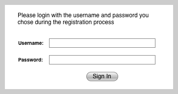
Image 1: An Example Login Form

Now using the rules that we’ve set-forth, if a user accidently tries to login using an incorrect username or password a clear and concise error message might look something like this:

image2.png
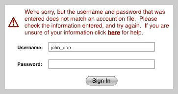
Image 2: An Example Login With Conflict

All of our basic rules are here. We’ve first shown the error message in a way that makes it clear a problem exists, using the red color along with an exclamation point to grab our users attention. It is then up to us to make sure that we continue using this format for any other errors. Next we stated a clear problem, the username and password information that was entered didn’t seem to match anything on file. The user can now try their information again in case they made a typo, or they can click for help which could take them to a way to recover their forgotten information. Stay away from generic error messages such as “An error occurred while processing your request,” or that discuss overly technical material like “The connection to the database DB_FINANCE has timed out,” as it is rare that your users would be able to interpret them to solve their problem.

It’s also a good idea to give the user a “Plan B” in case all else fails that gives them a direct way to receive your attention. Providing a live chat, support email, or a toll-free number is a good way to show your users that you are happy to provide them the special attention they need when a problem arises that they are unable to solve on their own.

3. It’s a Brand, So Use It!

If you currently have a branded product or service that customers purchase from you, let the brand be used consistently throughout the web address to allow for easy guessing. This can assist your more tech-savvy users in finding the products or services they are looking for. Some great examples of this would be:

  1. http://www.adobe.com/photoshop forwards users to the page to read more about Photoshop as well as purchase it. This works with the majority of their products.
  2. http://www.microsoft.com/windows forwards users to all things having to do with versions of Microsoft’s Windows operating system.
  3. http://www.apple.com/itunes takes the users to information and download instructions about Apple’s popular iTunes product.

One important thing to remember is to plan for people to incorrectly type the case of your product names. The iTunes product from Apple, Inc. capitalizes the T and lowercases the i when branding it’s product. However going to http://www.apple.com/itunes or http://www.apple.com/iTunes will take me to the same place. Apple, Inc. fails however to do this properly with their iPhone product (as of this writing). Spelling it exactly as the brand identifies with http://www.apple.com/iPhone will bring the user to an error, while http://www.apple.com/iphone brings the user to the correct page.

Essentially, help your users find their way easier by consistently allowing products to be seen by guessing the web address, it allows continued branding from the marketing end as well as being more efficiently pulled from the users visual memory when remembering the page they were previously visiting at your site. Lastly, don’t punish the user for using all lowercase or not spelling the product name exactly as you do, try to make sure all your site paths are not case sensitive.

4. Speak Their Language and Prepare for Typos

As the community of online users continues to increase their trust in commerce websites it becomes more important to get potential buyers to the products they are interested in. Unfortunately, the Internet has one major disadvantage to it’s brick-n-mortar retail store cousin, and that’s the ability to say, “I’m looking for a black hoodie with a picture of Time Square on it,” to a store employee offering assistance.

Online stores have search systems that allow you to type in keywords to make your search, however these search systems have a fundamental flaw; they aren’t human and are programmed to understand a product vocabulary as it is interpreted by the products vendor. Most of these searches will look through the name of the product and it’s description. If a product titled, “Black Sweatshirt with Hood” was available I might never know if I searched for “hoodie” the typical slang for such apparel.

So what do you do? When developing an online store it’s important to plan for administratively entered “meta data” keywords to describe the products that are also searched for when a user enters a word or two within your search box. This way when you create a new product, you can add its title, description, and some additional keywords related to it. Enter the slang, or commonly misspelled words within this area of your site allowing for more users to find the correct product they are looking for even if their search is flawed.

It’s important to mention too, however that planning for typos shouldn’t end at product searches. You should plan for common misspellings wherever possible, including the web address itself. As I recommended in my previous tip, it is important to continue brand and product names through the web address, and those too can contain spelling errors. For those of you more technical types, several products exist that allow for spell checking address paths on a web address (warning: some technical verbiage is coming). For sites being hosted on a Windows server running IIS consider looking into URLSpellcheck as for sites running Linux or UNIX based operating systems and Apache 1.3 or later, enable mod_speling (yes, there is only one “l”, it’s meant to be ironic) and use the CheckSpelling directive of “on.” Both of those products have their own documentation and own companies that support them, so it’s important that you research to judge the pros and cons of these various products and find the product that best fits your needs before jumping into a solution. Spell checking the web address takes a little bit of technical know-how, if you aren’t a technical person yourself you may want to contact your hosting company to look into options that might be available to you.

One last suggestion when it comes to planning for spelling errors. Have you ever been rushed going to a website only to find that you’ve entered only two w’s (such as ww. instead of www.)? Well, you’re not the only one. Top online retailer, Amazon, has planned for situations just like this. If any of their users attempt to go to http://ww.amazon.com by accident, they will quickly find themselves pointed to the right spot and redirected without a single sign that something went wrong. This of course is another option to consider when running a website and more information should be available to you by talking with your hosting company.

5. Create Results, Not Dead-Ends

No one wants to work for nothing, so don’t make your users do it either. If a user isn’t able to select an option on a search form because of another selection on the form, don’t make it an option. The last thing your users want to do is fill out a search form only to be told that have made an “invalid selection.” So, plain and simple, if they can’t do anything with it – it shouldn’t be there. Period.

It’s important to know however that this concept of creating results goes beyond just hiding things they can’t do. It’s important to give them as much ability to do business with you as possible. If the customer searches for a product but finds the product out of stock, don’t hide it in this case. Show them when you expect to have more in stock and allow them to sign up to receive a notification when that product has become available. You may even consider accepting pre-orders for the item that will be in stock shortly.

So in short, customers like the ability to communicate and buy the product they are interested in now. It’s hard enough to get a customer to press that “buy” button so there is no reason to stand in their way once the decision has been made. Always do what you can to minimize dead-end warnings or those “sorry, not in stock – please go to my competitor” scenarios.

To Err Is Human So Learn to Forgive Yourself

More then anything it’s important to know that you are not perfect. Even large companies have a hard time grasping their users’ behavior. A Lead Designer of Netflix, Inc. (the popular online movie rental outlet) has been quoted saying, “Predictions color our thinking. So, we continually make things up as we go along, keeping what works and throwing away what doesn’t. We’ve found that about 90% of it doesn’t work.”

Now all of us don’t have the resources that Netflix, Inc. has, but it is an important quote to remember when considering features that you might want to add to your website, don’t be upset if you don’t get it right the first few times. Test. Get Feedback. Rework. Test. Rinse. Repeat. Succeed. You get the idea.

Wrapping It Up

Contingency design, behavioral design, and other forms of user experience design are not always easy to grasp, but I hope I’ve been able to give you several basic tips to get you started. The key is always very simple, be on the side of your users, consider basic human behavioral needs, and your bottom line will grow from there.

As always, I’d love to hear the experiences you’ve had with your users when you’ve tested their behavior, used contingency design, or acted in favor of your user when developing a site feature – feel free to leave me a comment.

Card Sorting Your Way to an Improved User Experience

The Internet really brings some great benefits in further making information that normally wouldn’t be easy to find more accessible to the masses. The phrase “information in power” is often quoted, and just as with power, with great information comes great responsibility to those users who might need to find something amongst that information. Card sorting is a common practice in information organization that has been used in the web by information architects and designers since the mid 90’s.

All of us have our own way of looking at multiple items and categorizing them into groups, often times however the people we might be categorizing them for would have sorted them a far different way. This is where card sorting plays it’s role, it offers us a peek at how the users of a website might categorize (and thus search for) information on an ecommerce or large-scale information rich website.

It’s really simple to get started; a card sorting session doesn’t need to be overly technical by any means and is very cheap to execute. A Sharpie or pen and a stack of index cards are all the supplies you will need. Then there are the participants… if you have a physical store, ask some of your repeat customers. If it’s a company or organization, ask your clients or members. The key rule is, if you are a stakeholder in the website you aren’t allowed to do any sorting. Just watch and listen.

Using the index cards, write the names of the items you are trying to sort on the cards. Use only one item per card. For example, if I am making a cooking website perhaps I want to sort recipes, so my first card might read, “Lasagna”. Then for each additional recipe I would continue to write the name of a recipe down on it’s own individual card.

card-sorting-web.jpg

TWO TYPES OF CARD SORTING EXERCISES
With your cards ready to go there are two primary ways a participant might work with the cards:

Open Sorting is a session in which there are no pre-established groupings. It is up to the participants themselves to determine the groups of items and the names they would call the groups. If you can, this is by far the best way that you will understand how a user of your website will be looking for information. You will be able to gather far better results if you ask them to sort the items without restriction.

Closed Sorting is a little less helpful in my personal opinion as you have already created pre-established groups for the participant to sort their items into. For example, on my fictitious cooking website I might have told the participant to sort them into groups of “Italian”, “Mexican”, “Desserts”, and “Other”. To really mix things up I could add groups of “Pasta”, “Pastry”, and “Poultry” to give them some options that might give me a further understanding on how people might use my cooking website. Most designers and architects, myself included, do not encourage closed sorting because of the general restrictions on the results gathered.

The procedure is really just that simple. Take your stack of index cards and ask your participant to sort the items on the cards, as they feel most comfortable. There are no rules, or wrong answers. Don’t give clues of, “well that item has pasta in it, are you sure you want to put it there?” Just hand them the cards, and get out of their way. When the sorting is over feel free to ask questions to better understand their approach so you might best understand your website users behavior when looking through your products or information.

Remember also that your results will vary. You might find in some cases that your various participants are very consistent in their organizational style, while other times you might find that they vary widely. Don’t get discouraged, and realize that this is just a tool to help you understand your users, it is not a silver bullet to perfect organizational design and it may not apply as well to all websites being developed. No one is grading you here, so take your time and have fun with it.

Simulating a Table Using an Unordered List

NOTE: It should be said that semantically correct HTML should always be used in favor of <div> craziness. This is meant more as a proof of concept.

Your first question immediately might be, “why would I want to simulate a table with a list, why not just use a table?” With the raise in popularity of AJAX sortable list elements, using list items to represent a multiple column data table can allow for easy sorting of various more “tabley” information. So let’s get started.

First let’s look at our HTML:

Now the CSS:

Ok – I’ve left something out for space. I also implement the clearfix solution as given at: http://www.positioniseverything.net/easyclearing.html

I’ll keep this post short, because I’m expecting that you can figure out everything that was done by the HTML and CSS. Hope it helps someone somewhere to do something cool.

Result:

Web 2.0: Day 2 Recap – Sessions

Of course I am recapping here and reviewing most of my notes now that I am home. I still wanted to share what I had experiences so I’m posting this information a little late. Day 3 and 4 will be coming as well.

The New Hybrid Designer

This was a panel discussion that included Kelly Goto, Jeremy Keith, and Chris Messina. Unfortunately it become more of an introduction to the Design related track that really getting down the what it means to be a Hybrid Designer. Getting the designers to learn more about application design and architecture are some of the most important key points here. Using documentation such as that from Apple, their Application Design Guidelines is a great suggestion. Remembering as well that the line between design and development continues to grow thinner. Continuing to place strong consideration on “placelessness” – the idea that not only should content be separated from design but as well as context and device limitations. Chris Messina also made strong mention against applications such as Adobe’s Apollo which will end the “View Source” option, noting that many of todays developers have learned using the method of learning from someone else’s work. I was differently that person and I’m sure many of today’s beginners learned HTML are doing the same. It is important we don’t kill the growth of our community by developing applications that eradicate it’s growth.

Rich Internet Applications with Apollo

Sadly, the presentation with Mike Chambers as he tried to show the benefits of Apollo left me desiring more in general. I can’t blame Mike for it completely because the network was extremely congested and he was unable to demo many of the features of online application access. The thing that really has got me bothered by the platform in general is that, in a bad way, it feels like “half a product”. Now I’m a strong advocate of building “half a product” more then a “half ass product”. Perhaps I would lean to being more enthusiastic about this product if I felt the features planned for inclusion in their initial release was the “correct half” of the product.

If you are wanting to streamline application development to “bridge the gap” between the web and desktop platforms you need to create a way to easy deploy the single page/controller level updates to all the desktop clients. Streamlined, without interruption – with no option to not update the functionality. It would be a replica of the features you are mimicking from the web application you are converting. Not necessarily in user interface, but function and user experience.

Vulnerabilities 2.0 in Web 2.0: Next Generation Web Apps from a Hacker’s Perspective

This was an amazing conference session. Given by a partner of iSEC Partners a security research firm and pen-testing company. I’m hoping to get a copy of the slides as the presenter did tell us that they would be available. Getting into topics that were far more advanced then just simple cross-site scripting issues. Major vulnerabilities exist in all current AJAX framework implementations as well a big issue with most AJAX sites is that the functions and methods are rightly available to all visitors to the application. Having methods within your code for “MakeMeAdmin()” is ridiculous! But it still happens. Remembering as well using cross site forgery techniques are assisted because browsers will pass the cookie if it is active in the other window or tab – because cookies are shared among windows. It turns out the guys over at iSEC Partners are going to be publishing the new Hacking Exposed book in December 2007 entitled ‘Hacking Exposed: Web 2.0’.

The Arrival of Web 2.0: The State of the Union on Browser Technology

I’ll be honest and say I don’t know how much really came out of this session other then, “Browser companies are starting to work today.” People representing Opera, Mozilla, and IE were on the panel. Other then continuing to hear that Firefox 3 will offer local store so you can natively develop offline applications and that the Mozilla foundation is working on issues that exist in JavaScript as it is currently being implemented using Ajax (the previous session was of course stuck in my head at the time). That was about it on that one.

Web 2.0: Day 1 – Workshops

So today was the start of the Web 2.0 Expo for those of us attendees registered for the workshops. The official beginning tomorrow for the other sessions and expo hall.

I’m slowly getting used to Pacific Time, thought it’s 10pm here and I think I’m still about 1-2 hours off. So the workshops…

The Iterative App: From Discord to Design

The day started with Kelly Goto – a favorite author of mine who wrote “Web ReDesign” which was all about merging User Centered Design with Agile Development Methodology. It was the biggest high I had received in a long time when I was sitting there in the audience and here this author that I respect so greatly was pushing the same techniques and still that I’ve been trying to evangelize. The idea that you really need to target your users emotional usage of your product more then anything for it to me successful. That you just need to “pick a feature” – and start with just that feature it in the beginning building off of that along with what you users actually are doing with your product. Her example was Flickr talking how it originally began as a gaming platform, but everyone was simply using the photo sharing portion – so it evolved with how people were using it. Products most evolve of time! Small pieces growing toward a closer idea of what the user NEEDS (not wants). She uses a great quote from Henry Ford of, “If I would have asked people what they wanted, they would have told me a faster horse.” Products must solve a “need” and not be created from a “want”. Plus she filled in a lot of hole in my of my methodology theory that involved research and testing.

The second half of her workshop was a little touchy as many of her slides where out of place and we were running late. Thankfully she promised all the finished slides would be available at a special URL for our usage and study. She even hinted at another book grouping UCD ideals with Agile rather then the previous “Core” framework she previously developed. I’m highly looking forward to seeing that come to market.

All in all, but myself and the other architect with me that attended Goto’s workshop released at every level that our process just wasn’t cutting it in the real world.

Ruby on Rails with David A. Black

I wasn’t sure what I should expect from David’s workshop so I walked in pretty open minded knowing I would now have an outlet to have many of my questions answered. The room was filled with Java programmers looking to prove Java better as a language. I felt bad for them. Here they are in their J2EE world and this little language has been growing and taking many Java jobs away. The wanted to stand up for their language. So many questions came regarding performance and if Ruby could actually be faster the Java or even compare to it. David was very patient and answered all of their questions as best as we could without he, himself being a Java Developer.

After the presentation we took a break were David fielded some questions prior to him taking a break himself. As I was answering one gentleman’s question regarding development with Ruby and Rails I found myself with a growing audience from all areas of the world. Here I was, little ol’ me talking to PHP programmers, Java Programmers, .NET Programmers, C Programmers, and even a single ColdFusion developer. I only hope that I articulated the benefit of Rails well enough, but it felt good explaining my point of view on Rails and to get feedback from other developers.

Once we regained the group together it was time to write some Rails code. I spent some time with David asking my small questions that I just couldn’t get my head around which he handled willingly and I feel far better equipped to deal with certain application types now. But I think too he was happy to have someone there that could “get his back” because he didn’t feel right about defending one language over another. He also showed me some great things in TextMate that I can use when developing Ruby which I didn’t know before. It was definitely worth it to me to go because I got to see what I knew, and have questions answered that I just could figure out before.

So day 1 was great. I even got a free O’Reilly book that I’ve been wanting called “Designing Interfaces” – essentially a usability book. Tomorrow morning beginnings the sessions where I will be seeing Kelly Goto again regarding the “Hybrid Designer” along with Mike Chambers from Adobe regarding the new Apollo application. I’m going to try to get some of his feedback regarding the new features in Firefox 3 regarding local data storage along with Joyent’s Slingshot framework. I hope to really get a solid understanding of what the benefits of Apollo will be in comparison to what these other’s are doing.

Until tomorrow…